Sync - Revamp of a project management dashboard experience for Colliers
My Role
UX Design Lead
Category
B2B SaaS
Responsiblities
Redesigned key daily task user flows
Revamped UI + Design System
Optimized hierarchy & readability of tool
Impact
48k +
User transitioned
42 %
Faster task completion
Context.
Sync is a project management software built for desktop and tablet use, tailored specifically for the A/E/C (Architecture, Engineering, and Construction) industry. It streamlines cross-functional collaboration among on-site workers, project managers, clients, interior designers, and civil engineers by enabling real-time site updates, organizing project documentation, automating daily reports, and more.
The tool offers role-based permissions aligned with each employee's project role and tailored software views for different use cases - turning project coordination from an ad-hoc process into a streamlined workflow.
METHODS
User research
User journey maps
Heuristic evaluation
Wire-framing
Prototyping
User Testing
SUS Questionnaire
TEAM
2 UX Designers
1 Sr. UX Researcher
1 Product Manager
1 Dev Lead + team of 3
TIME
Feb 2024 - April 2024
Skip to redesign
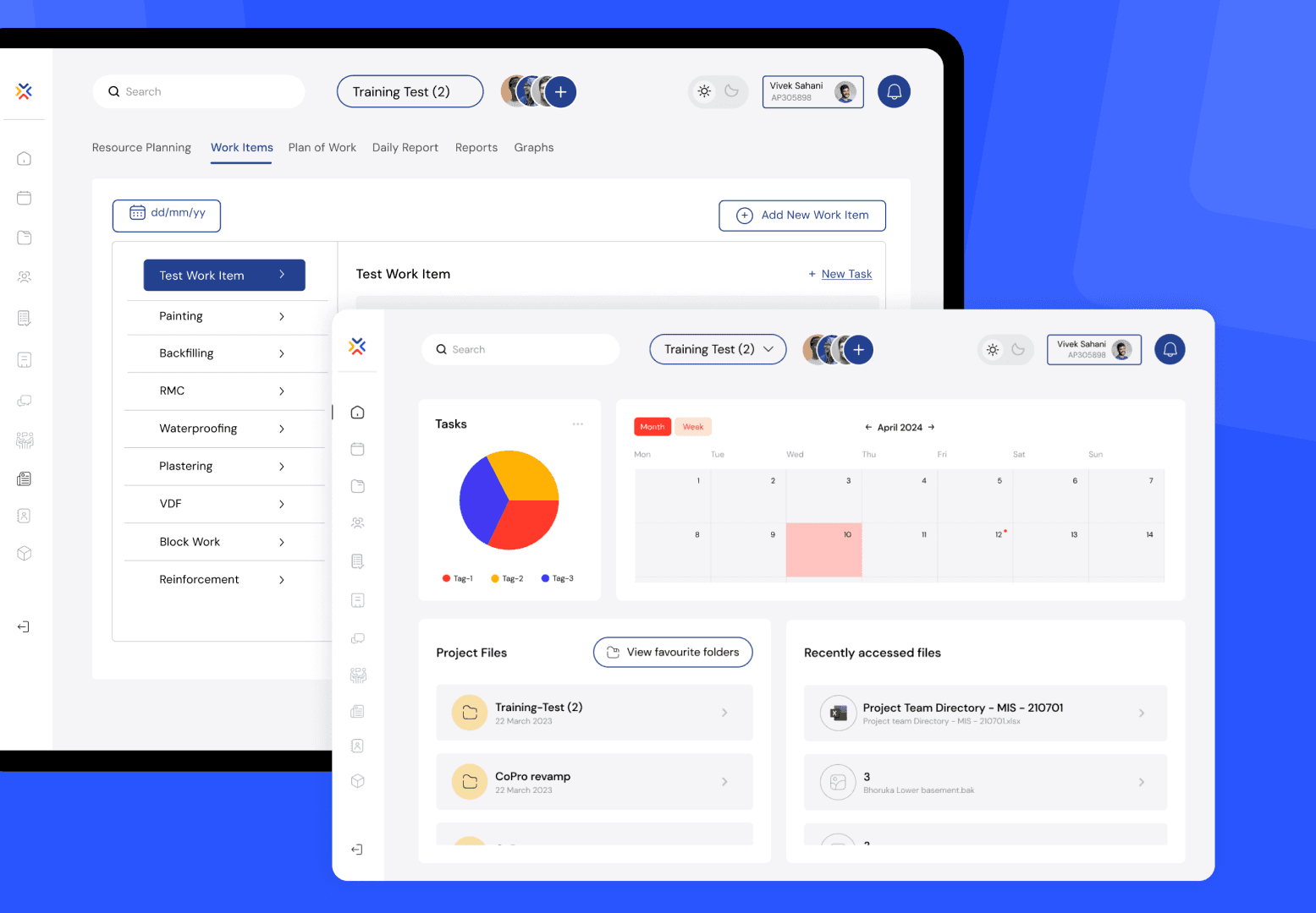
The dashboard lets users quickly access their on-site work permission forms, weekly schedules, project-specific file databases, and recently viewed files.

Process.

Stakeholders.

Project Admins
Responsible for overseeing project management activities within the organization.
Wield comprehensive control over the app's functionalities, including user management, document access permissions, and project tracking.

Contractors
Represent a diverse array of external partners and vendors engaged in collaborative projects with the organization.
Use the tool to participate in project-related discussions, access pertinent documents, and submit necessary forms.
Impact by numbers.
25%
Increase in employee engagement
42%
Decrease in task completion time
84%
Increase in user retention
Impact by experience.
Having everything in one place, from form history to scheduling and approvals, really streamlines the process.
Rajesh
Project Associate
The app is super responsive on my iPad now -landscape or portrait. This has changed the way I work on site! It’s quick and easy to navigate.

Ajay
Contractor
So easy to access recently viewed files and switch between projects.

Surabhi
Project Associate
The interface is incredibly intuitive. I’m making fewer misclicks, which is saving me so much time.

Reshma
Associate Project Manager
The contrast is great, and I can clearly see everything, even when working in direct sunlight on bright days.

Vimal
Contractor
The Challenge.
1
For on-site workers
Completing tasks like submitting forms or filling out reports was often frustrating due to cluttered layouts and frequent misclicks. A major contributor was the low color contrast between primary and secondary CTAs, which became especially problematic outdoors, where glare and changing lighting conditions made it harder to distinguish interface elements clearly.
2
For project managers
The need for a seamless switch between multiple ongoing projects, assigning roles within in-built group chats, managing meeting logistics such as scheduling, sharing agendas, and recording Minutes of Meeting, as well as accessing audit history for various submitted forms - all within a single, unified platform.
3
From a business perspective
Designing Sync as a scalable SaaS solution for the A/E/C industry meant building robust customization capabilities to support diverse workflows and organizational hierarchies. This included enabling white-labeling options - such as brand-specific colors, fonts, and logos to better appeal to enterprise clients and enhance marketability across a range of companies.
Addressing the challenge.
Developed role-based information architectures to cater to different levels of the organizational hierarchy
This approach reduced information overload by 1/3rd and significantly improved workflow efficiency.
Line-level workers
Managerial staff
UI Components.
These components were developed based on guidelines from the Ant Design system.

Navigation bar
home active
Recent files panel
Project Files
View favourite folders
22 March 2023
Training-Test (2)
22 March 2023
CoPro revamp
22 March 2023
CoPro revamp
22 March 2023
CoPro revamp
Drop down menus
field active & inactive
Radio buttons
active & inactive
Rg Test Package - Test
MEP Package - ABC
FIN (Field Inspection Notice)
DQ (Design Query)
NCN (Non Compliance Notice)
NCR (Non Compliance Report)
CO (Change Order)
SD (Site Directive)
FIN (Field Inspection Notice)
Inspection Result Status
No Objection
No Objection with comments
Rejected in part
Rejected in whole
Checklist
Pop up container
Upload attachments panel
Project access component
selected & unselected
CTA’s
Download
Download
Inactive
Active
Attachments
Drawings
Photos
Others
Upload document
Upload document
Upload document
Yes
No
Are you sure you want to download form report?

The Redesign.
What changed and Why?
Why did we need a redesign in the first place?
The old interface, originally built in the 1990s, was outdated and no longer aligned with modern technology trends. Over time, workflows within the A/E/C industry evolved significantly, but users continued relying on the same legacy tool - adapting by taking longer, more complicated routes to document details and complete tasks, ultimately slowing down productivity and increasing the risk of errors.
So, as a design and tech consultancy, @ Six30 Labs - we recognized the untapped potential in transforming this outdated system into a modern, scalable SaaS product.
The existing user base had grown accustomed to inefficient workflows, not because the tool met their needs, but because there were limited alternatives tailored specifically for the A/E/C industry. With a strong in-house design and engineering team, we saw an opportunity to reimagine the platform from the ground up.
This included not only revamping the user experience but also building a robust backend infrastructure that could support customization, real-time collaboration, and integration capabilities. Our goal was to create a product that wasn't just functional but also market ready - something that could be packaged and sold as a comprehensive project management solution for A/E/C teams across various scales and specializations.
The Homepage, Groups and Files pages required significant UI standardization. The pain points on each screen were identified through heuristic evaluation and were further validated by insights from stakeholder feedback during contextual inquiries.


Tasks page (After)
Action Buttons
All CTA’s were made consistent and made easy to access.
Distinct buttons for 'New Task' and 'New Group' were added to minimize clicks and reduce initial user confusion.
Pagination
A clear indication of the user's current page was provided.

Forms > Design Query form (After)
Addition of breadcrumbs for simplified navigation.
Addition of a dialog box when the user clicks 'New form' to simplify the form creation and prevent errors.
The form type could be quickly selected from the dropdown menu in the top-left corner.
Improvised view for filtering form status.
The form number can be easily selected from a dropdown displaying all active DQ forms.
Each form can be edited, with audit history displaying details of who made changes, when they were made, and any comments added.
PDFs of each form can now be generated, with the download CTA appearing only when a specific form is open to prevent confusion.

Daily Report (After)
Main categories moved to the top and each acts as a tab.
Sub categories under each main category can be chosen from drop-down.
Empty states, missing states for fields in the form were added.
Users can now add ‘New Task’ and ‘New Subtask’ directly under the ‘Work Items’ tab, avoiding repeated form entries for the same main task.
Under the ‘Plan of Work’ tab, weekly and monthly tasks were now differentiated for ease of use and review.
The 'Daily Report' tab now allows employees to submit weather reports directly, replacing the need for a separate logging platform.
An interactive cursor-follow feature was added to the graphs.

Forms > Material inspection report
A document used to assess and verify the quality and compliance of materials before they are used in a project. It ensures that materials meet specified standards and are suitable for their intended purpose.
Key features :
Project Information - Details such as project name, location, inspection date, and inspector's name
Material Details - Information about the materials inspected, including type, grade, manufacturer, and batch numbers
Inspection Findings - Observations on whether materials meet project specifications, including any deviations or non-conformities
Photographic Evidence - Visual documentation of the materials' condition
Deficiency Remediation - Recommendations for addressing any identified issues
Minutes of Meeting (MOM)
A document used to record the key discussions, decisions, and action items from project meetings. It serves as an official record, ensuring that all stakeholders are aligned and aware of their responsibilities.
Key features :
Project Details: Includes project name, meeting date, location, and attendees
Agenda Items: Lists topics discussed during the meeting
Attendees: Specify necessary and optional participants
Decisions Made: Documents resolutions and agreements reached
Action Items: Specifies tasks assigned, responsible individuals, and deadlines
Additional Notes: Records any other pertinent information or observations
User Testing.
Feedback that counts
🔒 This information is restricted due to NDA. Please reach out for access.
Latest projects
See some of my other projects
{
Research | IISc Bangalore
}
Bridging gaps in asthma management in adolescents
Research Synthesis, Product strategy, Conceptualization, UX design, User validation
{
B2B | Web design
}
Designing Create Studio's digital presence
Responsive Web Design, Micro interactions
Scroll animations
{
B2C | Usability testing
}
Optimizing resource access on Washington 211 website
Surveys, SUS questionnaires, Affinity diagramming, Redesign recommendations