Available For Work
Local Time ( GMT+5:30 )
Sync: Transforming project management for Colliers with an intuitive dashboard design
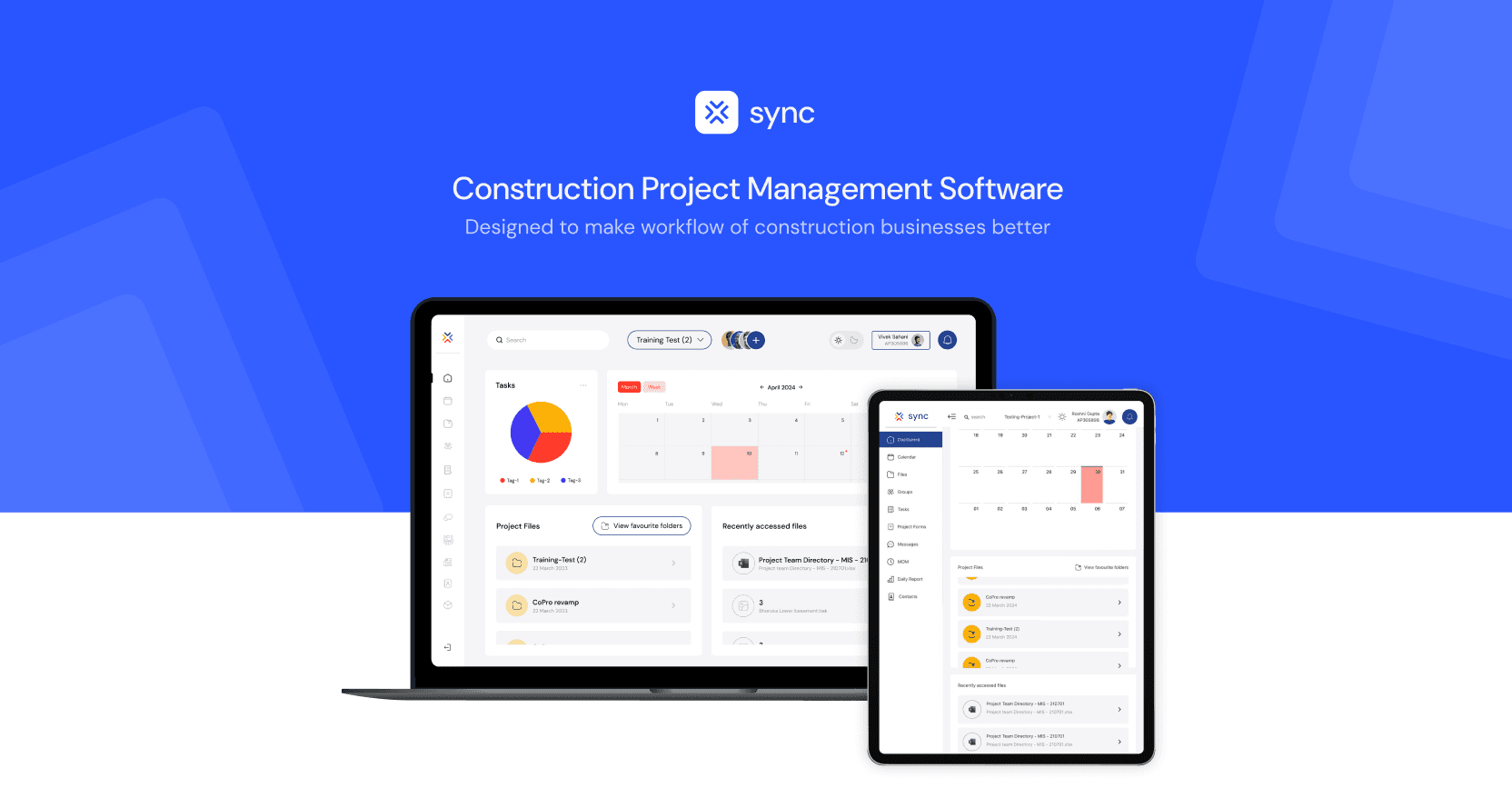
Sync is a collaboration tool which provides project team members in the construction industry with a channel for communicating, viewing project documents, logging forms, which will incorporate all processes on one platform to increase transparency into the activities being done at site also to create a record and ensure enforcement.
My Role
UX Research, UI Design, Prototyping, User Testing
Timeline
Feb 2024 - Aug 2024
Company
Colliers
Founded
1976
Industry
Real estate
Company size
16,000+
Within the application, users are categorized into distinct roles, each with specific privileges and responsibilities. The key user roles include:
Project Admins — employees responsible for overseeing project management activities within the organization. They wield comprehensive control over the app's functionalities, including user management, document access permissions, and project tracking.
Contractors & Consultants — these individuals represent a diverse array of external partners and vendors engaged in collaborative projects with the organization. As non-employees, they rely on the app to participate in project-related discussions, access pertinent documents, and submit necessary forms.
The app's architecture caters to the unique needs of both internal and external stakeholders. For project admins, it offers robust tools for project oversight and administration, streamlining processes and ensuring accountability. Meanwhile, contractors and consultants benefit from user-friendly interfaces that facilitate easy navigation and seamless interaction with project materials.
Challenge
To redesign and elevate Colliers' project management dashboard—SYNC—the design team at Six30 Labs took on the challenge of crafting a platform tailored to the distinct needs of construction project management.
The goal was to not only build this for Colliers but to also sell this as a SaaS product for companies in the same sector.
To cater to this,
Our goal was to create an intuitive solution that both on-site workers and project managers could seamlessly use to manage projects, handle material permission requests, and coordinate personnel.
We developed role-based information architectures to cater to different levels of the organizational hierarchy, from line-level workers to managerial staff. This approach reduced information overload by 1/3rd and significantly improved workflow efficiency.
Given the platform’s breadth and the complexity of its interactions, our team anticipated numerous UX scenarios that would need unified, intuitive, and efficient solutions. To address this, we prioritized compactness and clarity as key design principles in this redesign.

Results
The redesign introduced optimized solutions for key functionalities, including:
Streamlined the process for filling and submitting material request forms.
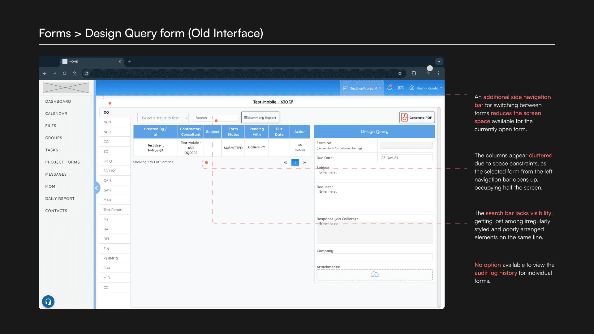
An organized layout for managing design queries and compliance reports.
An intuitive note-taking system for documenting minutes of meetings.
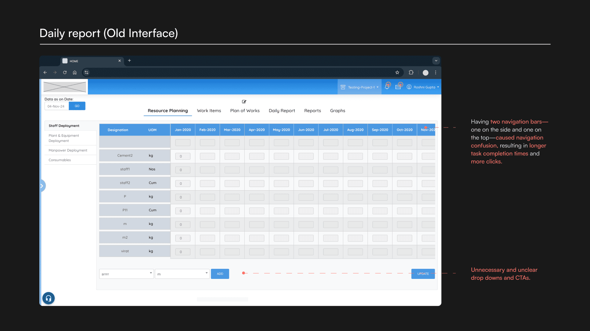
Improvised organization of daily reports and their subcategories.
Enhanced accessibility of group data, making it easy to access information on various worker groups (construction, carpentry, plumbing, electrical, etc.) as well as vendor details, by building a user-friendly database.
This complete overhaul modernized a system originally built in 2001, replacing its outdated UI and reducing the number of steps needed to complete tasks.
25%
Increase in employee engagement
42%
Decrease in task completion time
84%
Increase in user retention
Process
While the project didn’t follow a rigid design methodology, we adhered to a structured process to ensure that the final solution addressed both user needs and business goals. Here’s how we approached the redesign:
Discovery and research
Stakeholder Interviews: Engaging with project admins, contractors, and consultants to identify pain points in the existing system.
Competitor Analysis: Reviewing similar SaaS tools in the market to establish benchmarks and uncover opportunities for differentiation.
Contextual Inquiry: Observing workflows to understand real-world challenges faced by both on-site and off-site users.
Defining user goals and building an information architecture
MinMinimized information overload.
Enhanced navigational clarity for both internal and external stakeholders.
Ideation & Wireframing
Design execution
Testing & refinement
Implementation & Handoff
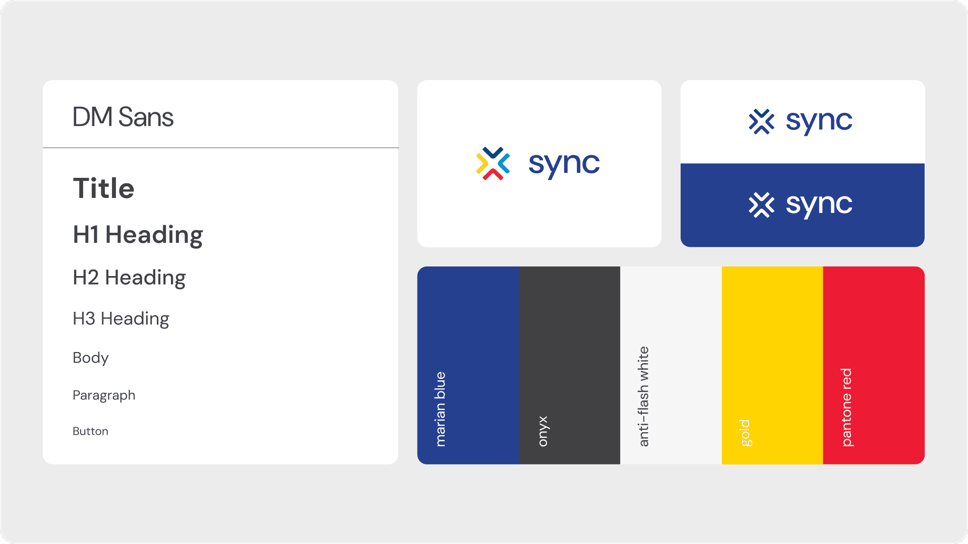
Logo, fonts & colors
——
Designs (Old vs. New)
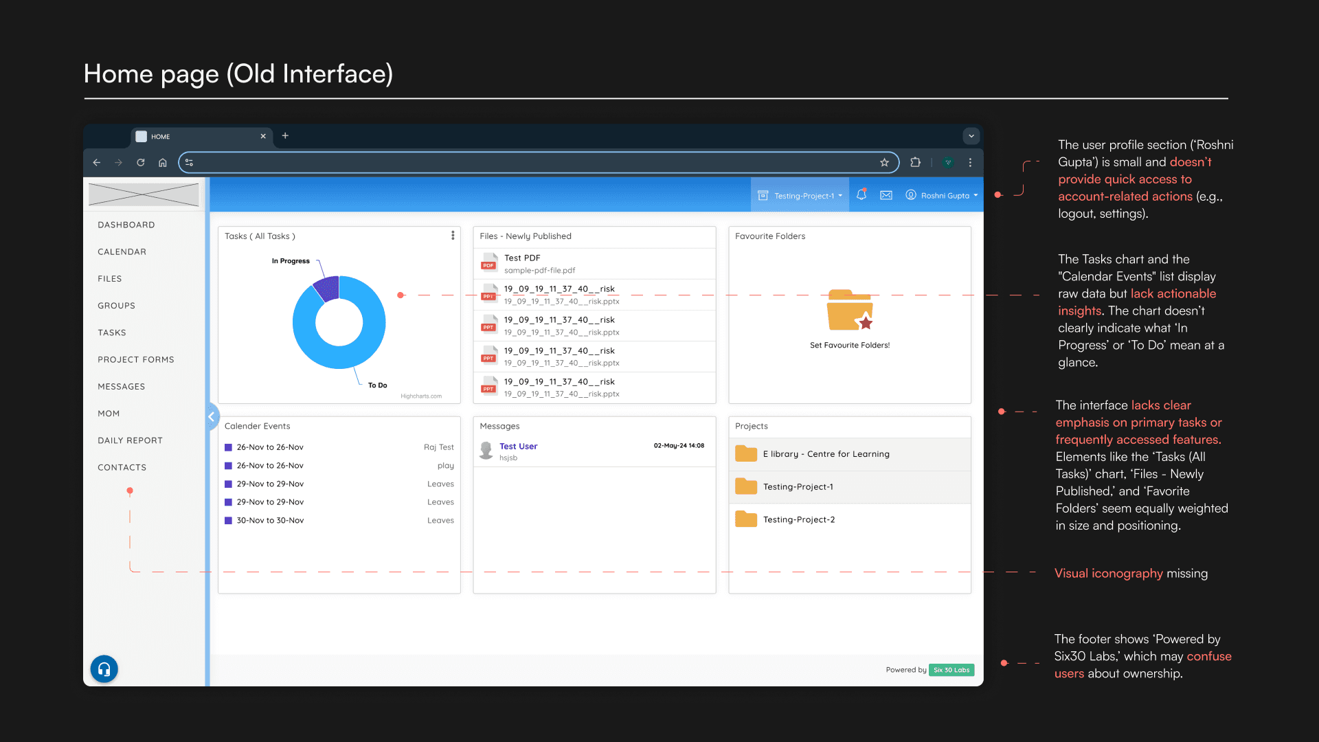
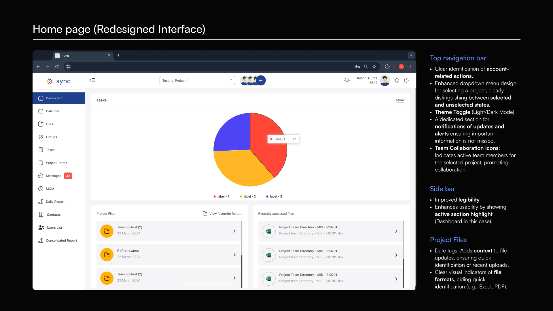
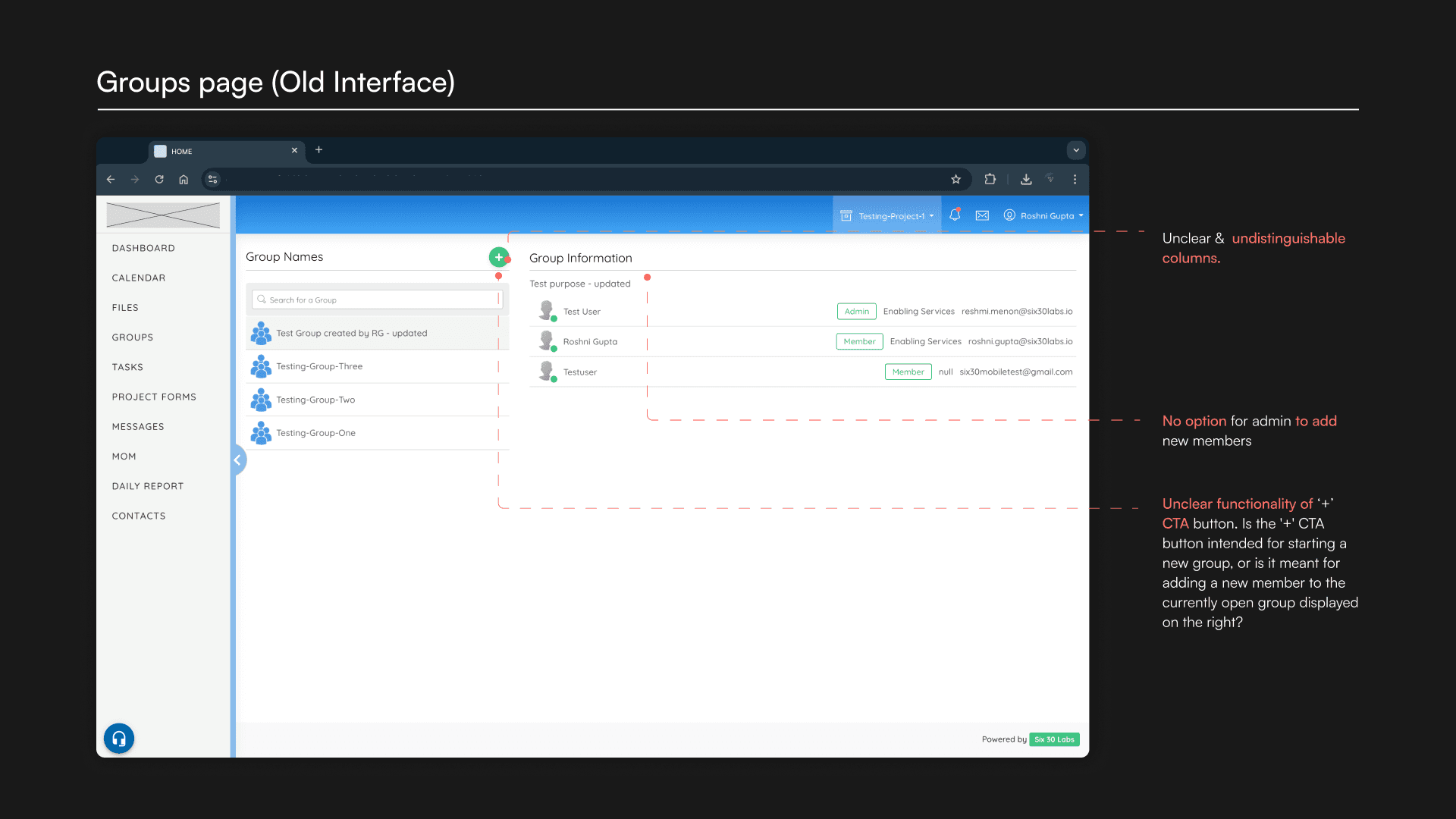
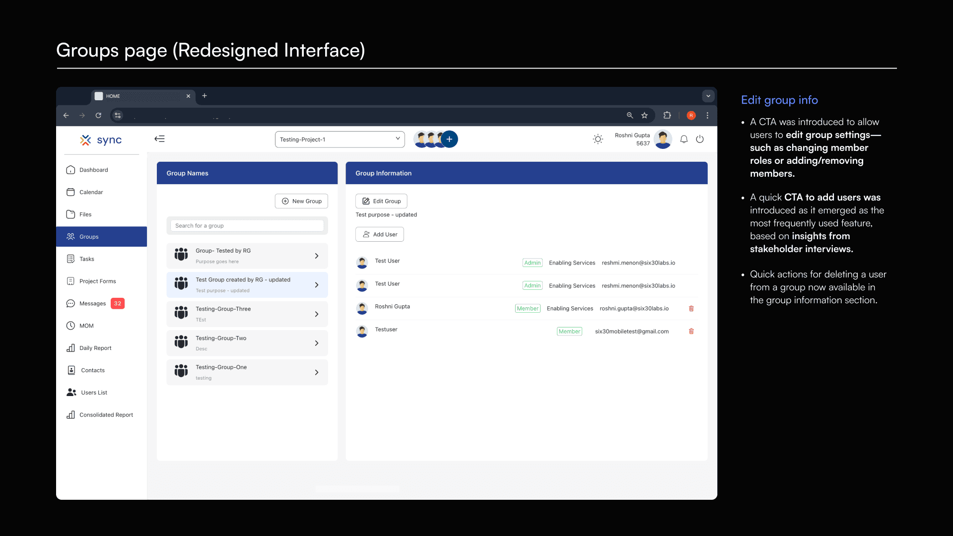
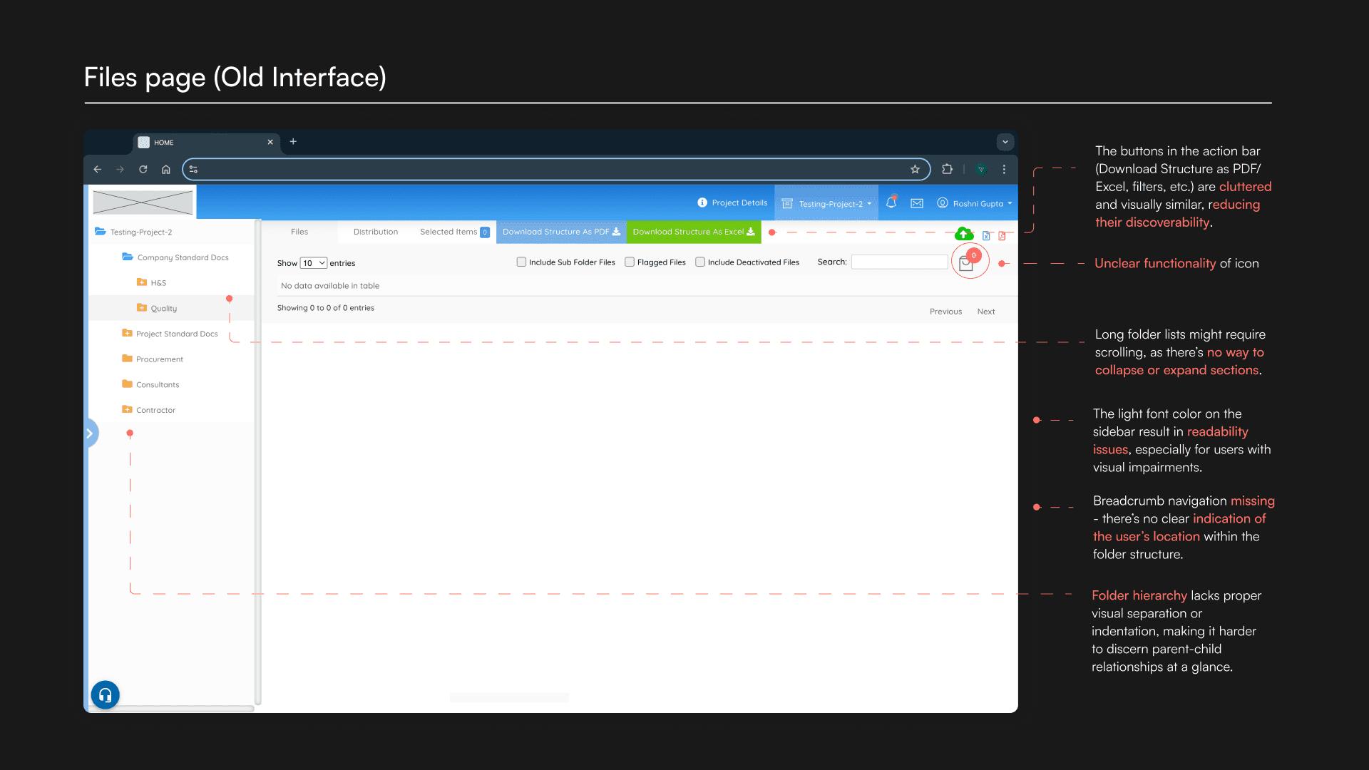
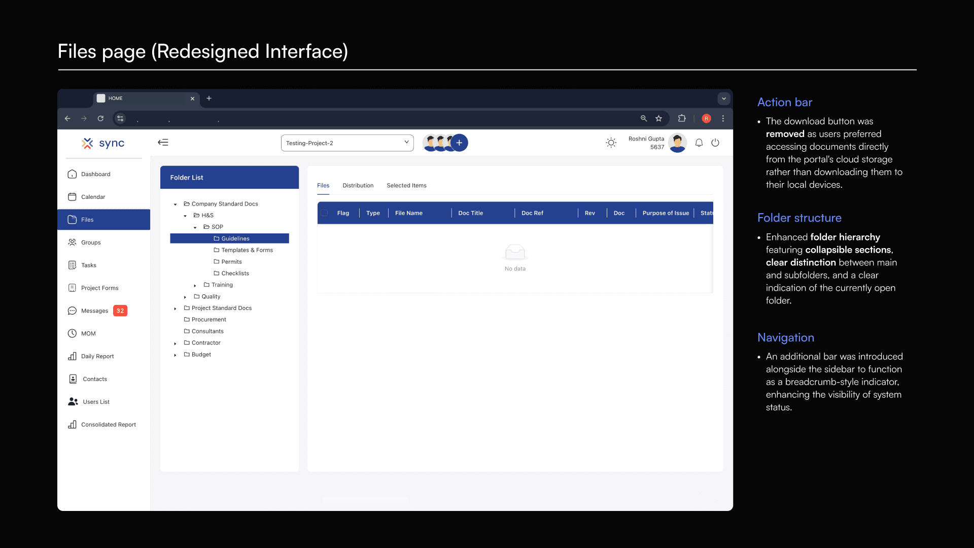
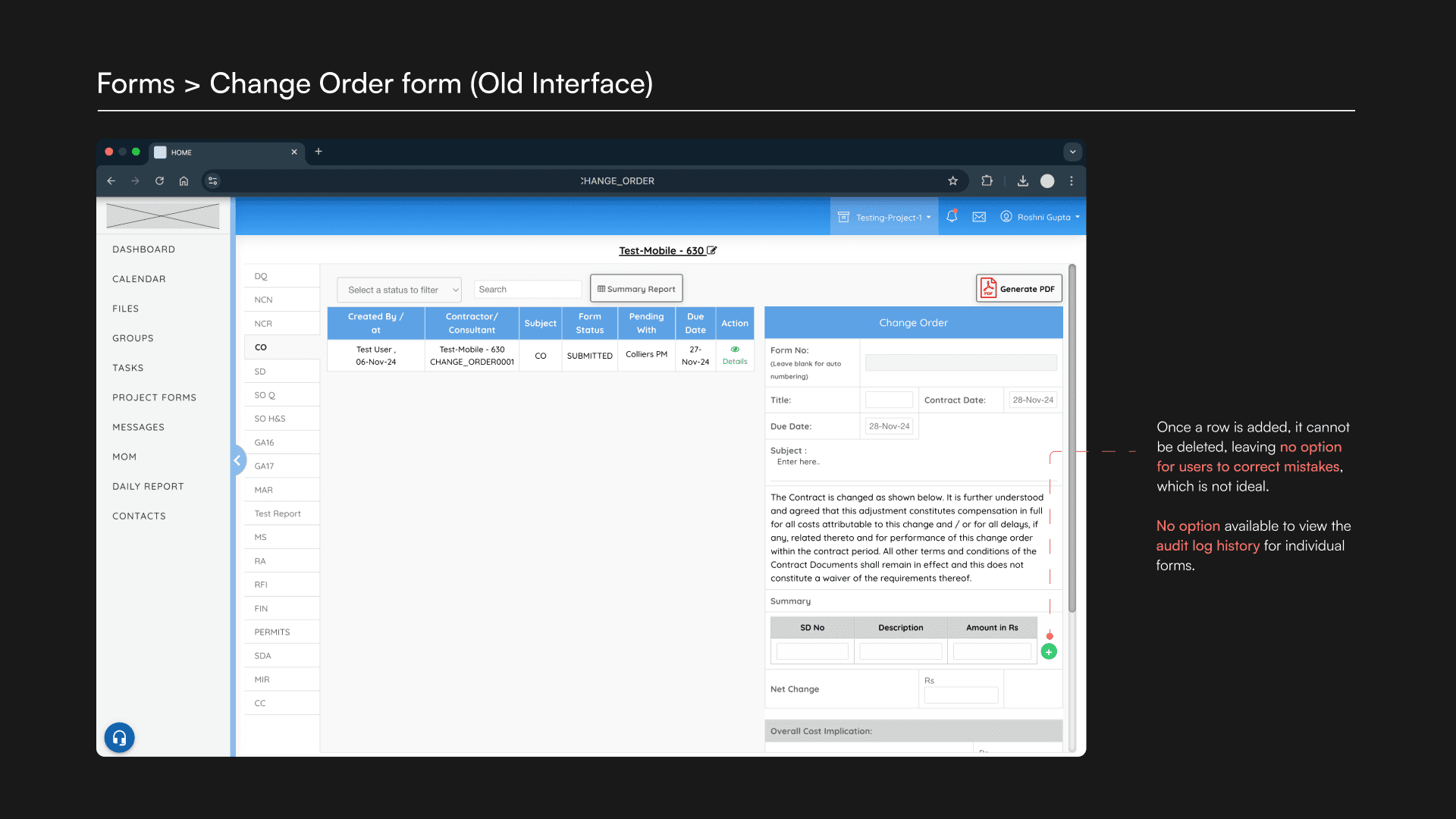
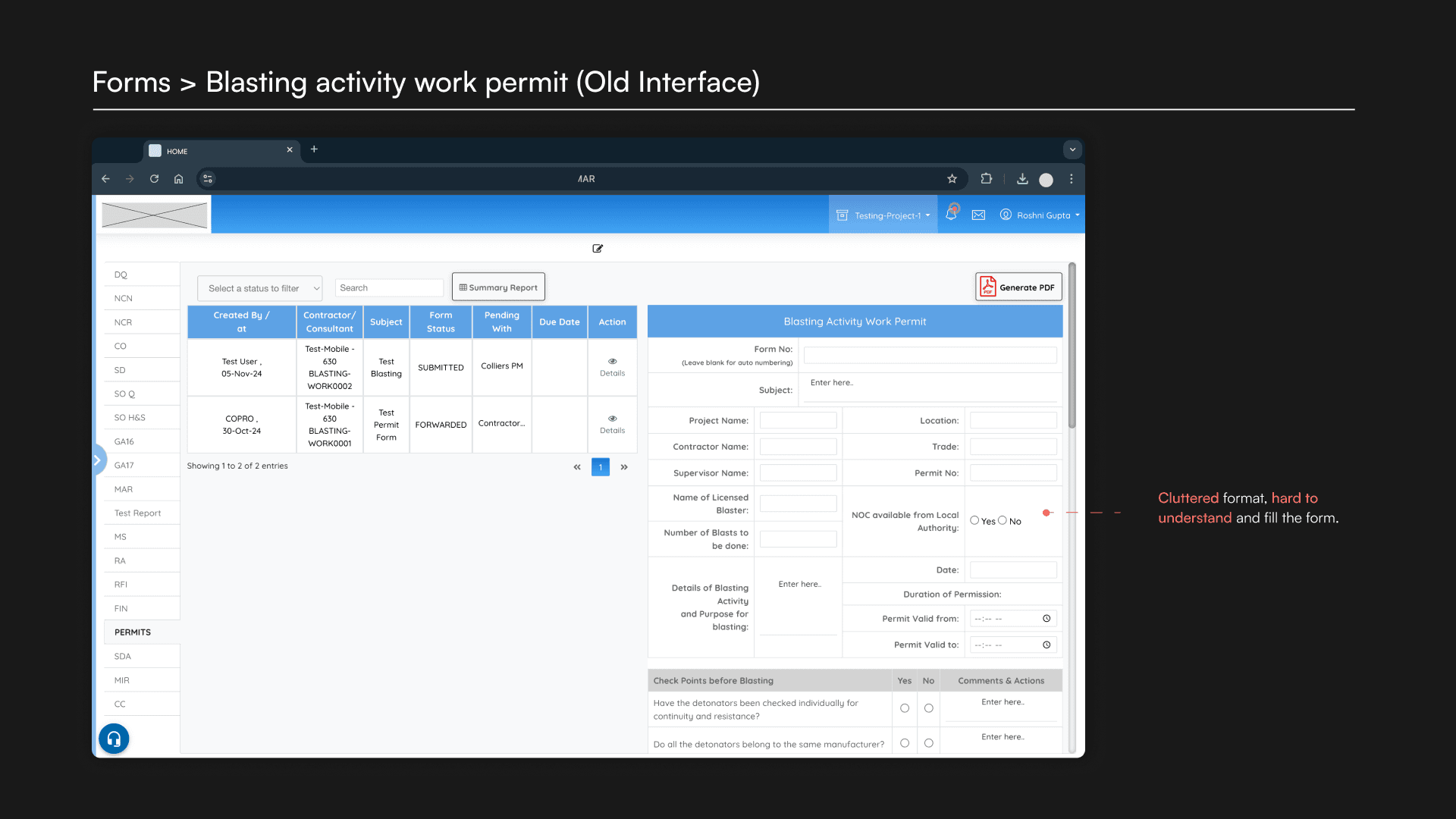
The Home, Files, and Groups pages, which required significant UI standardization. The pain points on each screen were identified through heuristic evaluation and were further validated by insights from stakeholder feedback during contextual inquiries.
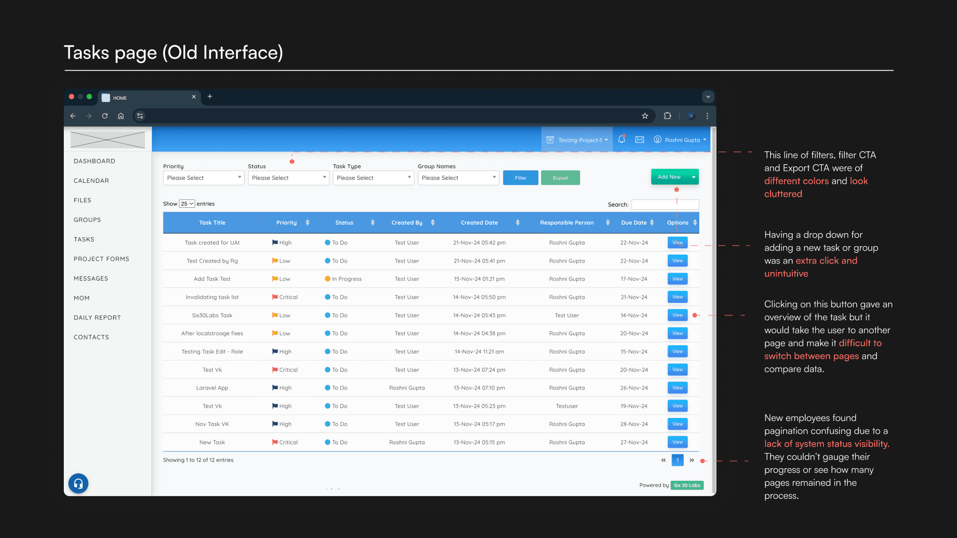
The Tasks page underwent a major UX redesign. Previously, viewing task details opened a split-screen view, compressing the existing content. To address this, a new dialog box was introduced, allowing employees to access task history, comments, details, and descriptions in a consolidated format. This streamlined approach provided a more user-friendly way to summarize individual task information, previously scattered across multiple table columns.
